Stretch app
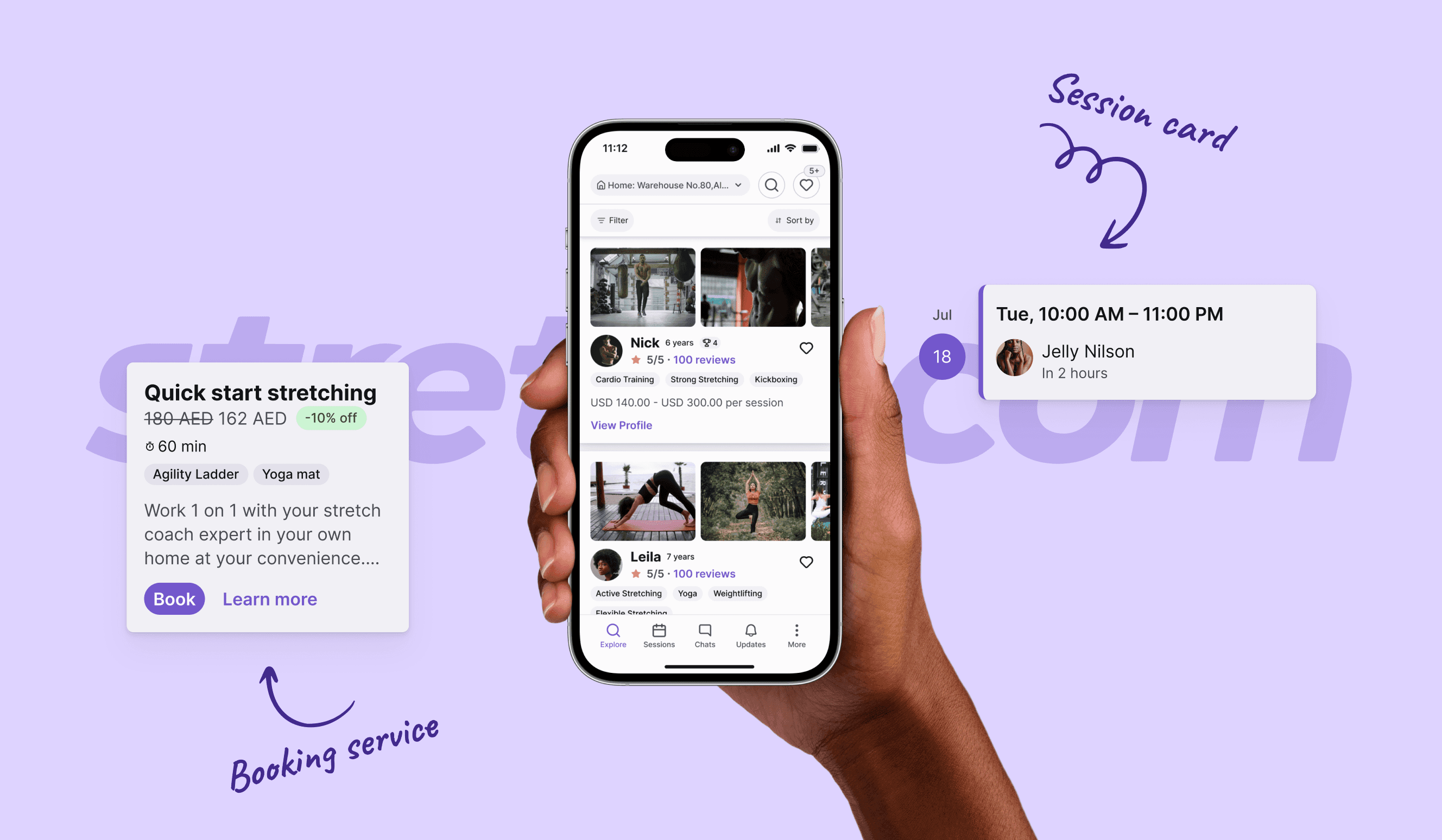
Stretch is an innovative startup designed to connect clients with nearby coaches for personalized home-delivery stretching services. The platform comprises three core components: the Client app, the Coach app, and the Admin panel.
Industry
Health & Fitness
Tools
Platform
Mobile app
Duration
2022-2023
Challenge
The task was to redesign the Client and Coach apps, which had usability, logic, and accessibility issues. Key features were missing, and the experience needed a complete overhaul. We also had to design a new admin panel from the ground up, requiring a rethink of the structure and interface for efficiency and scalability.
My role
As the Lead Senior Product Designer, I drove the project from concept to delivery, defining the design strategy, leading cross-functional teams, and ensuring that user-centered design was at the heart of every decision. I took ownership of project planning, led design critiques, and ensured that the final product aligned with both business objectives and user goals.
Results
The redesign effectively addressed key user and business needs in the booking flow, leading to a 52% improvement in overall performance and significantly enhancing clarity and usability. In addition, we created a robust design system that simplified the development process, allowing for faster updates and easier modifications.
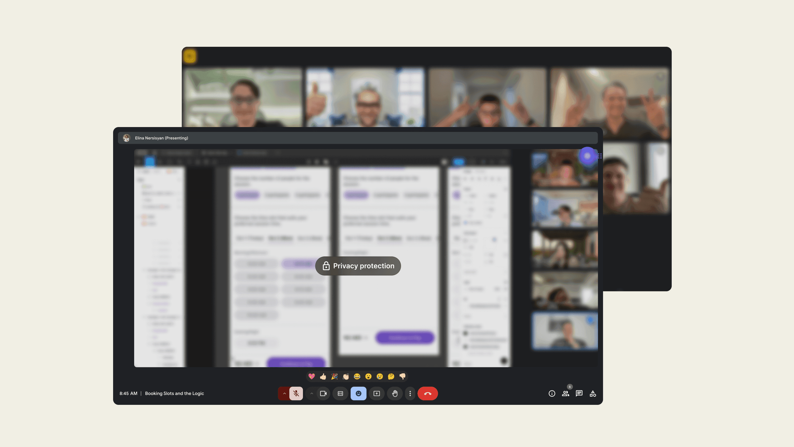
Early Google Meetings with our tech team discussing initial project ideas, development strategies, and technical challenges.
Introduction
Our client operates two successful stretching studios in Dubai, UAE. Through their customer base, they gathered valuable insights, revealing a strong preference for home-delivery stretching services. This shift in customer demand reflects a growing trend in the fitness industry, where convenience and personalized experiences are becoming essential.
The goal was to create a service that could cater to the needs of clients in the comfort of their own homes, providing flexibility and accessibility that in-person services couldn’t match.
To achieve this, they envisioned launching a new product that would connect people worldwide with certified stretching coaches for home delivery. This innovative solution aimed to meet the rising demand for personalized, on-demand fitness services, aligning perfectly with the growing global trend toward virtual fitness solutions.
Competitors & Features
For the customer-facing app, the company targeted the luxury segment, focusing on health-conscious individuals, predominantly men aged 40 and above, who are typically top managers of various businesses.
Competitor analysis
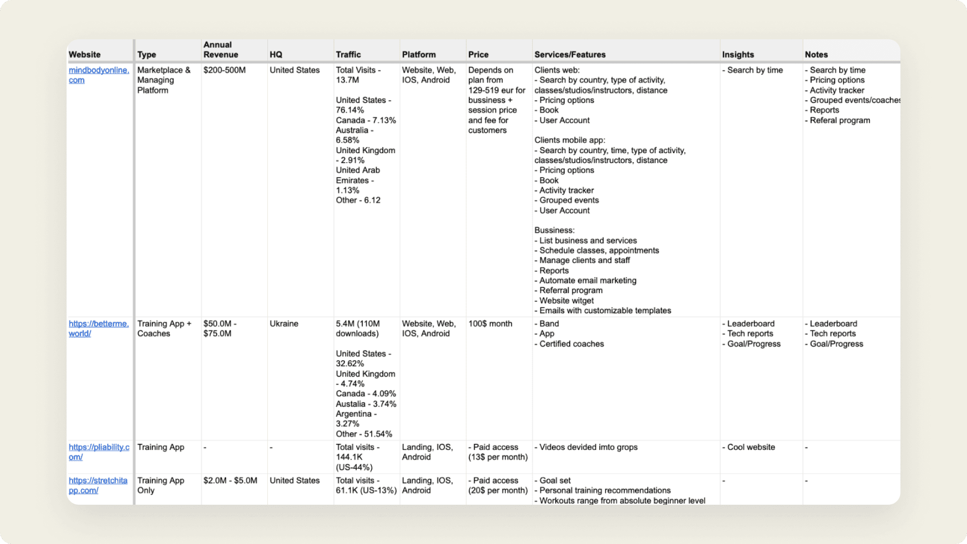
The spreadsheet compiled during this stage revealed crucial insights about the competition, including their revenue, client demographics, pricing models, and the features that attract new customers.
A section of the competitor analysis spreadsheet, displaying data gathered from desk research.
Feature prioritization
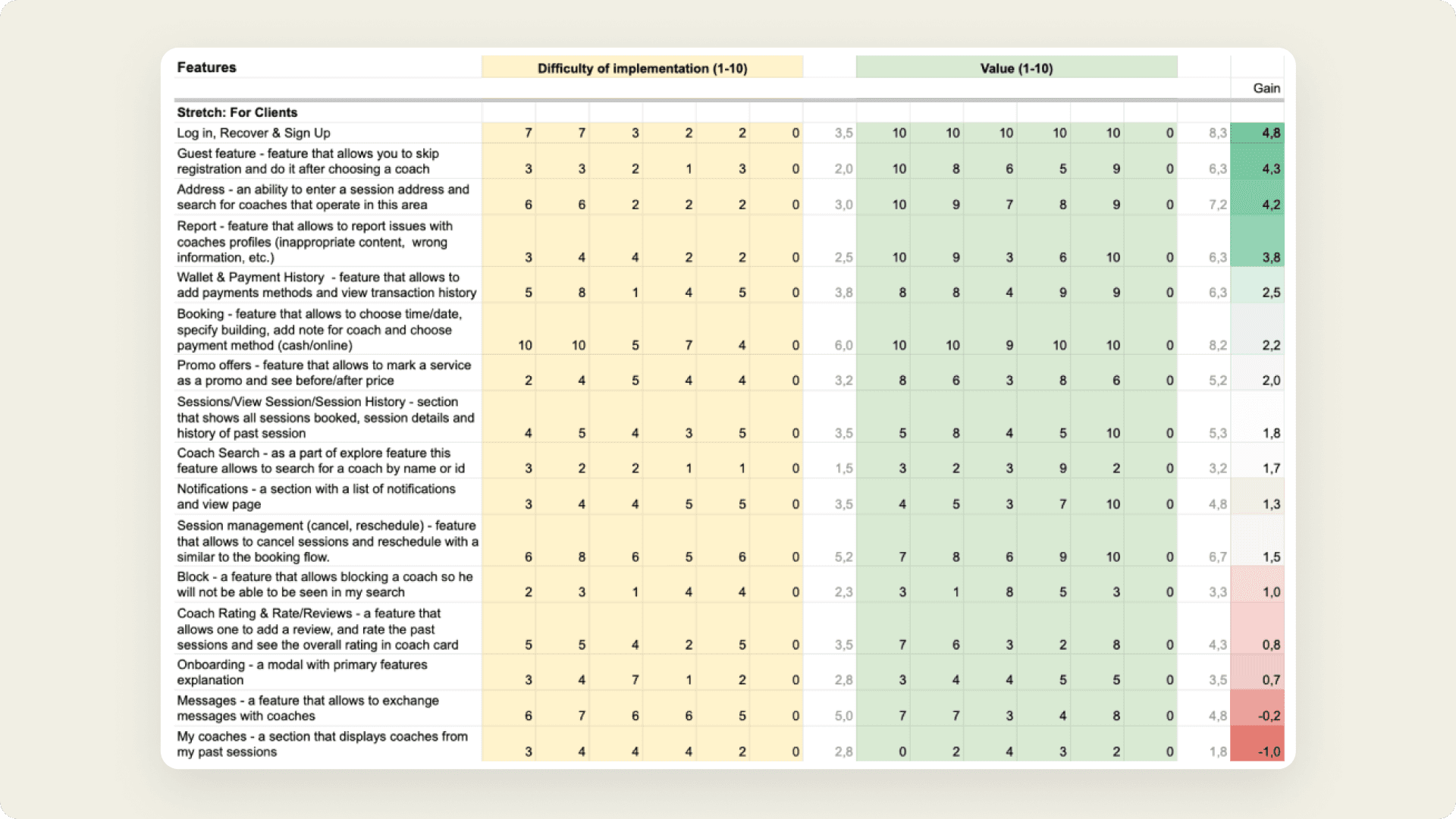
Feature prioritization clarified development priorities, highlighting high-value, low-effort features. This streamlined workflow and ensured efficient resource use, resulting in a user-centric product that boosts customer satisfaction and competitive advantage.
A section of the spreadsheet that prioritizes features using the Value vs. Effort Matrix framework.
Structure & Wireframe
Robust wireframes were constructed using advanced tools such as Object-Oriented UX (OOUX) and Business Process Model and Notation (BPMN). This approach led to a refined app structure that effectively resolved all major issues identified in the initial phases.
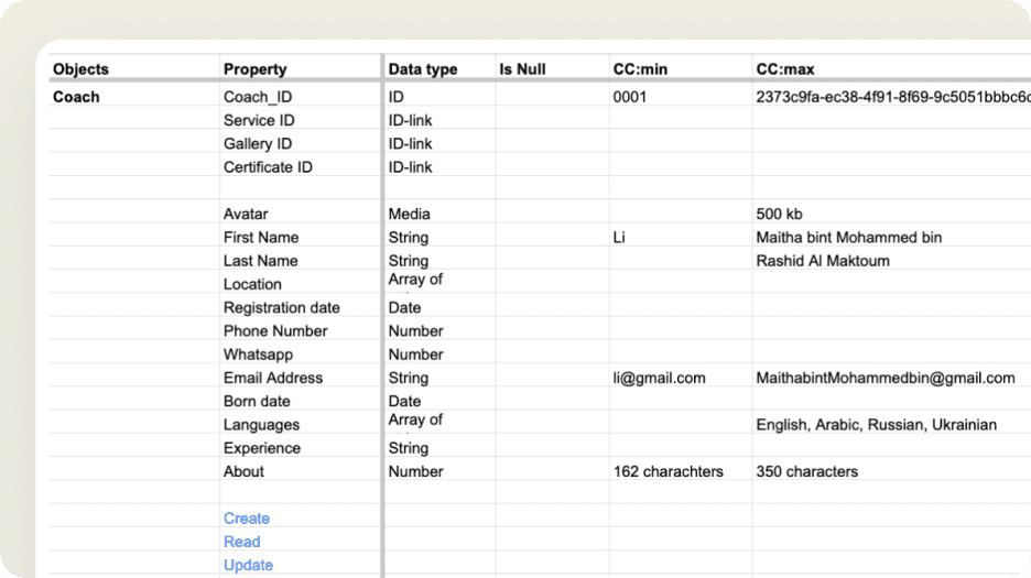
OOUX Table
A table and object-property map were meticulously developed to elucidate the relationships among all system components.
Table Outlining Relationships Between Key Objects.
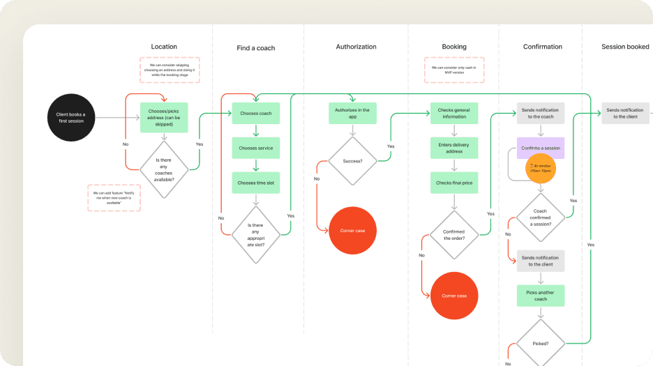
BPMN Flow
A detailed BPMN flowchart was created to provide clear insights into the interactions among all system components.
Flowchart Depicting the ‘Client Books a First Session’ Process.
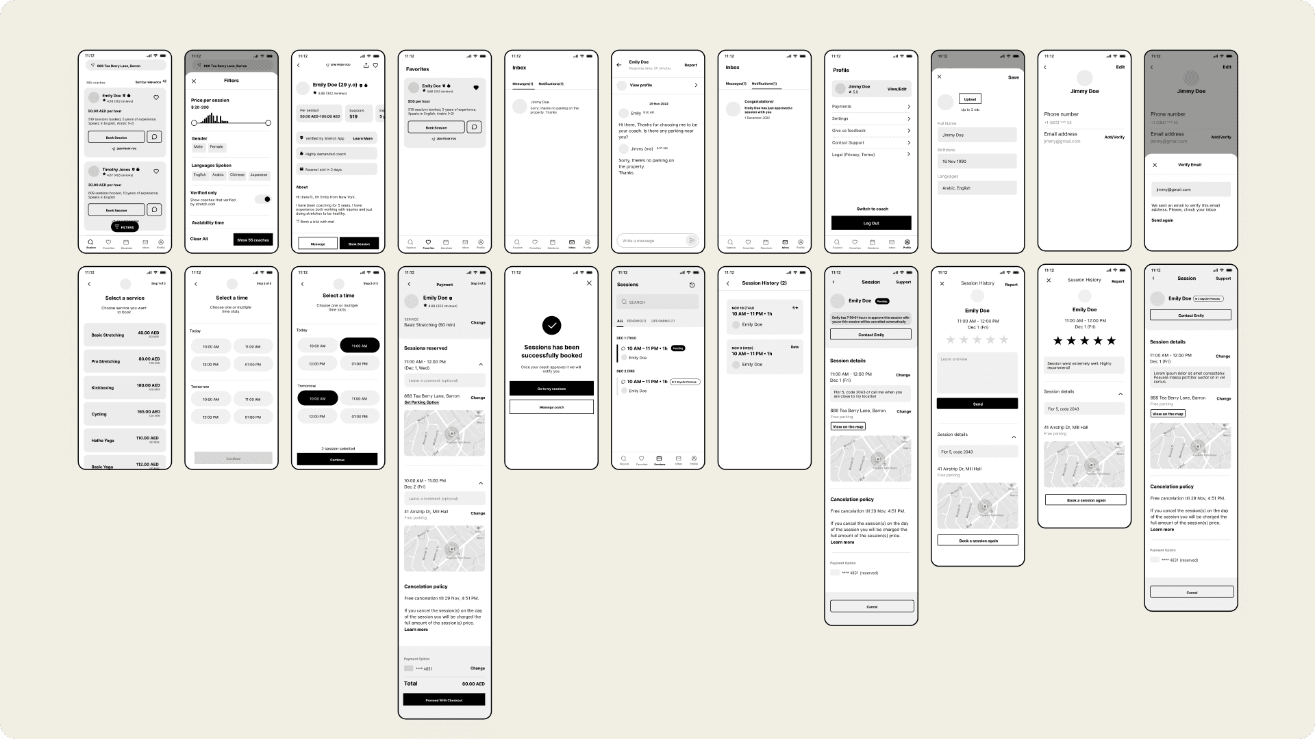
Wireframes
Leveraging artifacts from earlier phases, the wireframes for the app were crafted to serve as a visual roadmap for the interface layout. These wireframes detailed the placement of elements and the user interaction flow, addressing and resolving key design challenges.
Initial Wireframes of the Explore Section in the Client App, Later Refined Through Subsequent Iterations.
Design system
Both apps feature a robust, internally-developed design system, built on-the-go. While based on Material Design principles, it incorporates unique elements, including a custom color system with an internally invented color builder. This allows for quick theme creation, including dark modes and interactive states.
The design system includes variables for styles such as elevation, opacity, blur, radius, and spacing. These variables help maintain consistency and flexibility across the user interface.
Additionally, the system offers over 50 components and patterns, speeding up development and ensuring that all elements are reusable and consistent across the apps.
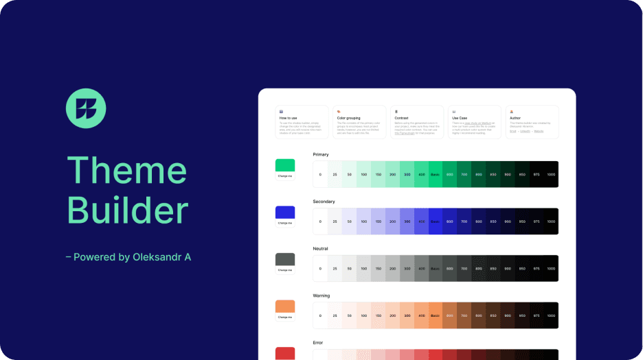
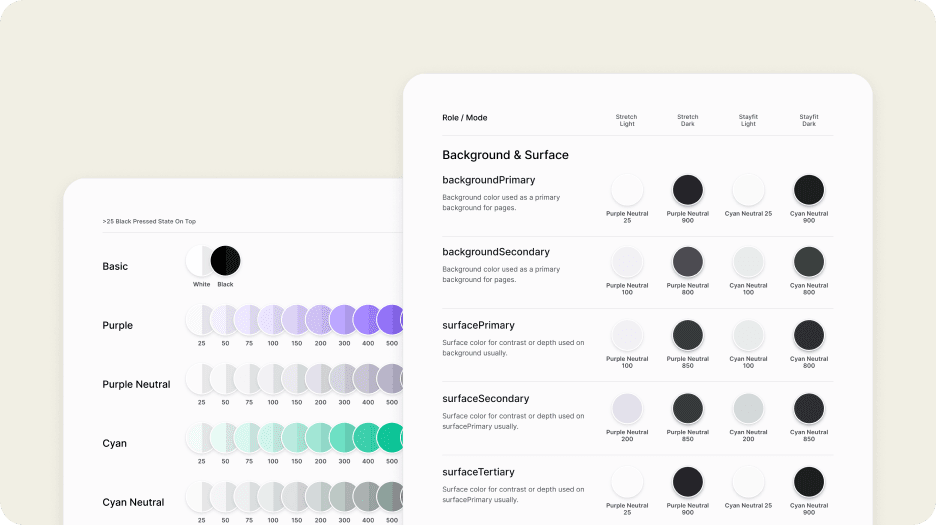
Color builder
Automatically generates a range of shades from a single base color, providing consistent and scalable color variations for design use.
Color theme builder that generates shades from a single base color.
Color tokens
Standardized color tokens applied across brands, apps, and color modes, ensuring visual consistency throughout the system.
Primitives applied to color tokens across multiple brands, apps, and color modes.
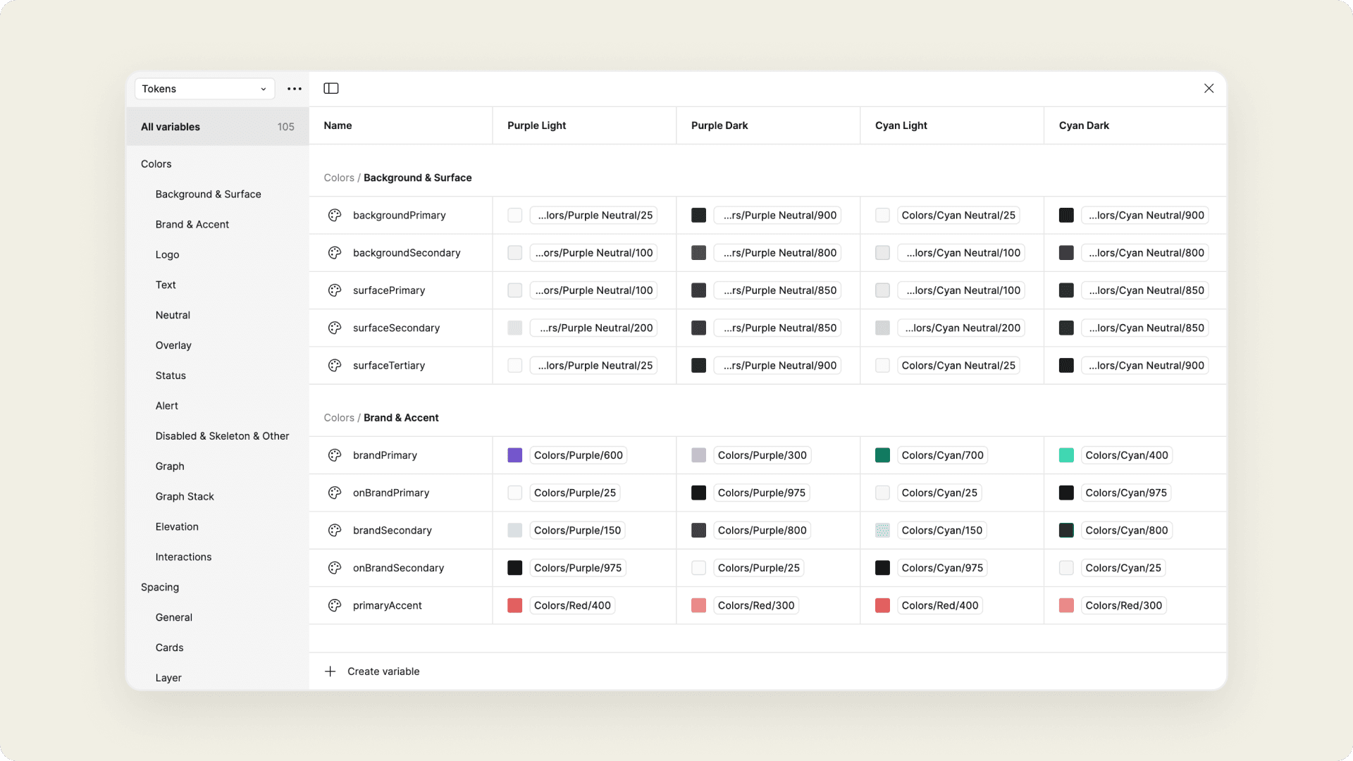
Variables & Styles
The design system leverages variables by using tokens for styling elements such as color, elevation, and interaction. This approach minimizes manual work by linking styles and tokens to foundational primitive values.
Screenshot of the Figma variables panel in the design system file.
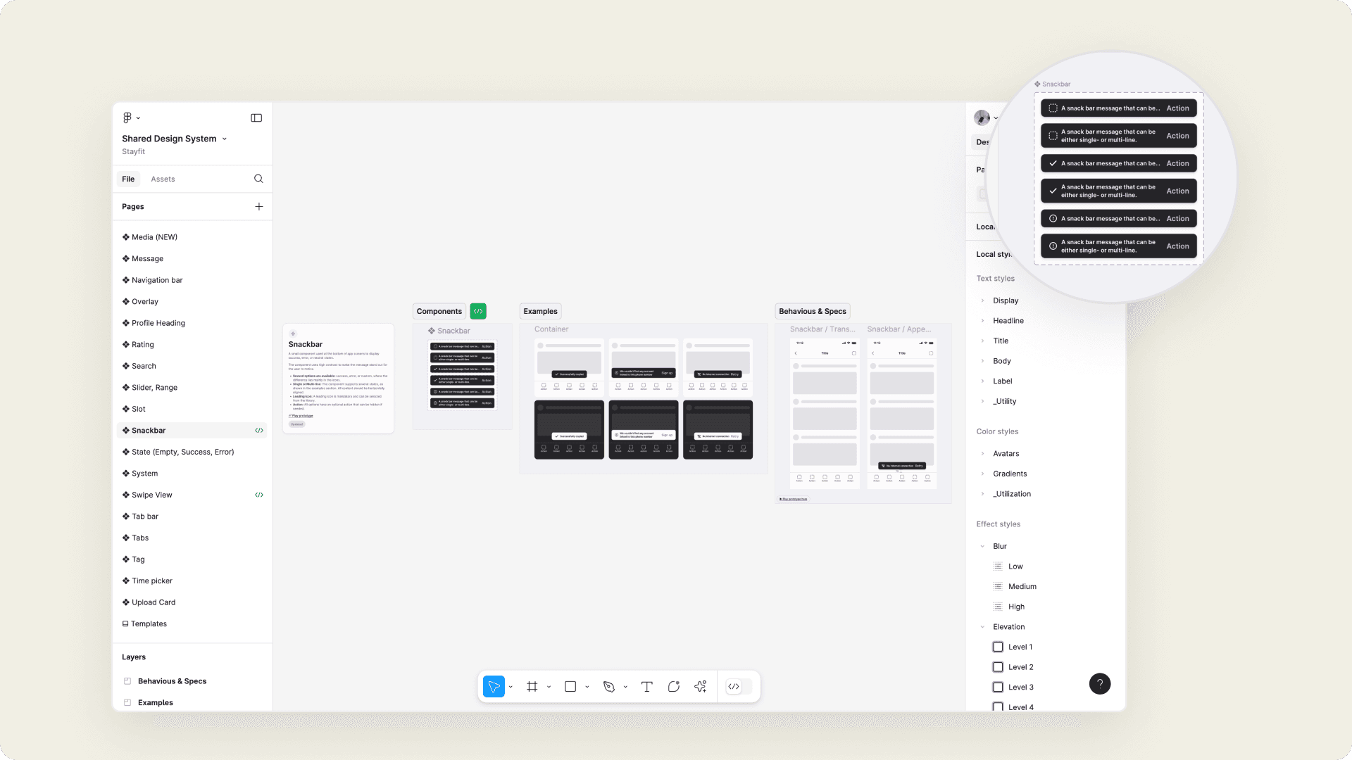
Components & Patterns
The system includes numerous components and patterns, all designed with scalability, consistency, and accessibility in mind. Each component features a base version and nested variations and documentation, ensuring flexibility and clarity in use.
Examples and guidelines for component section structures.
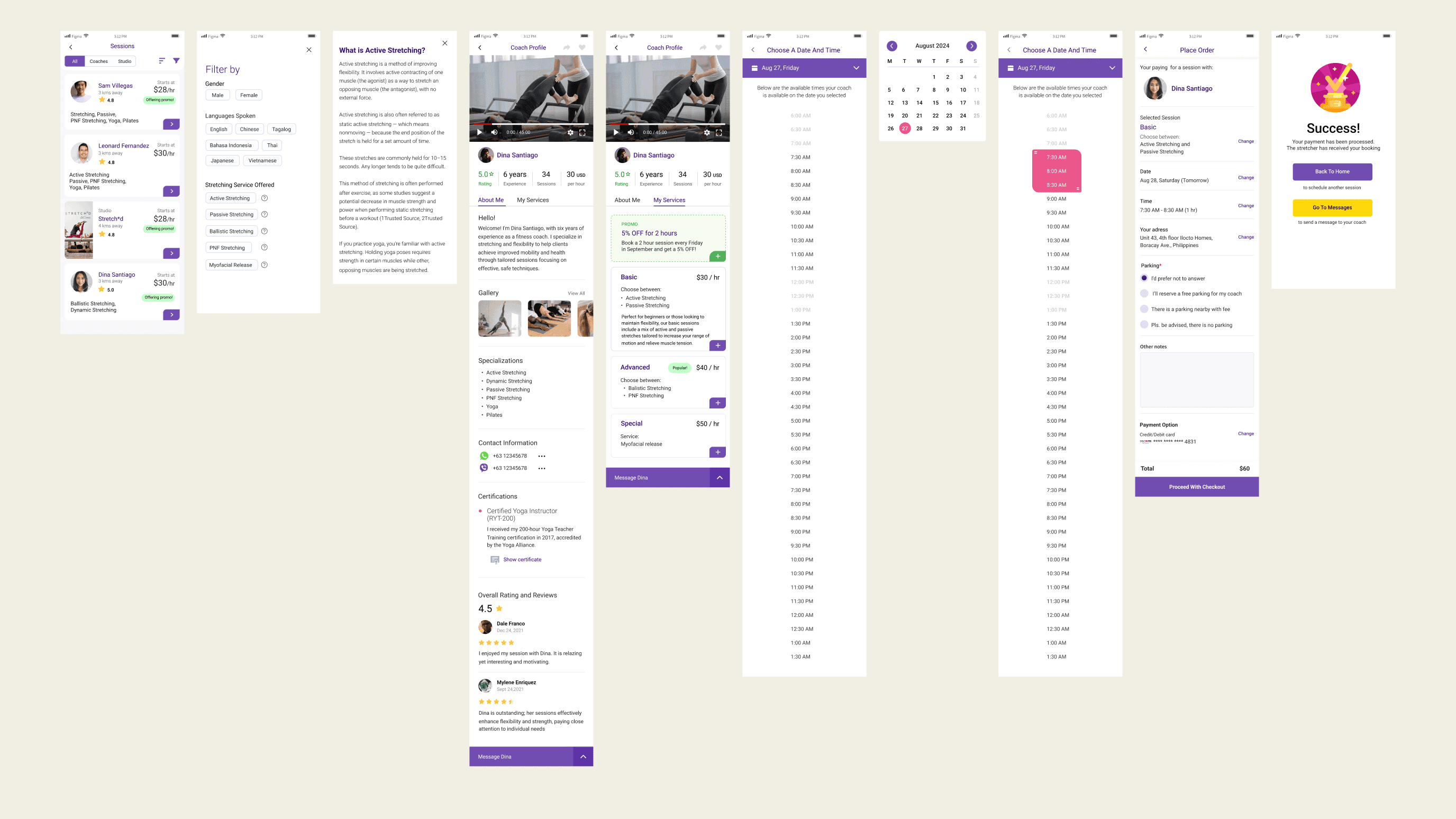
Old booking flow screens showing steps like selecting a coach, choosing a service, and completing the checkout.
Visual design
The major issues identified in earlier phases have been resolved, making the flow clearer, more user-friendly, and significantly more seamless than the previous version.
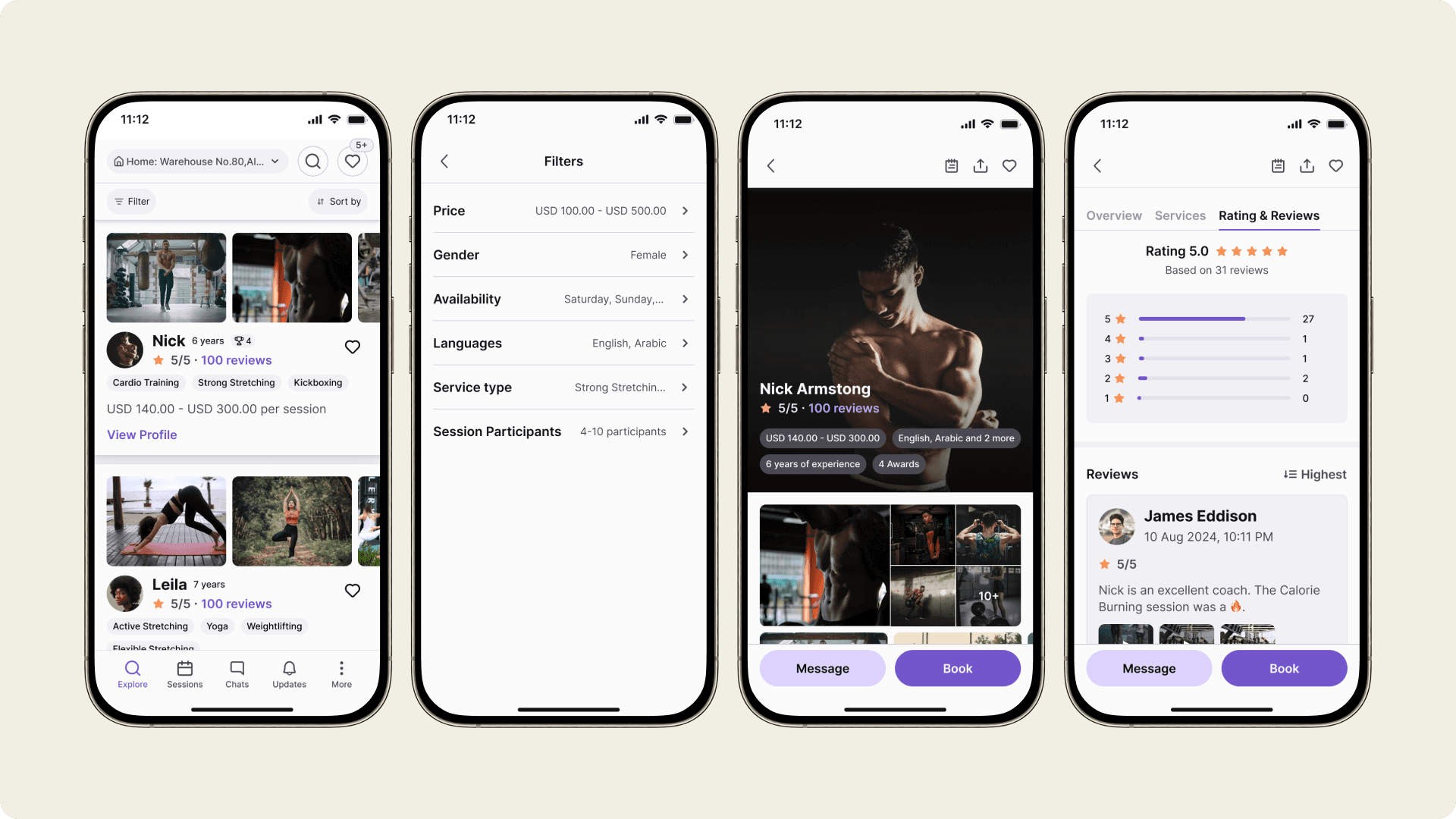
Find a coach
Users can filter and sort coaches by location, service type, and ratings, ensuring quick access to the most relevant options. The saved feature allows users to bookmark favorite coaches for easy future bookings.
Filtering, sorting, and saved items interfaces within the client app.
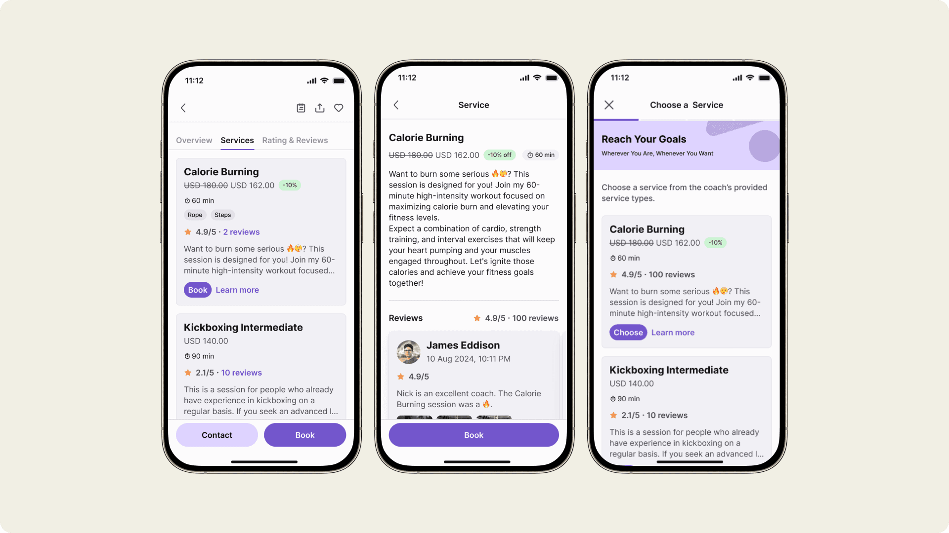
Choose a service
Users can choose and read more about a service they interested in and books the session either from services or details page.
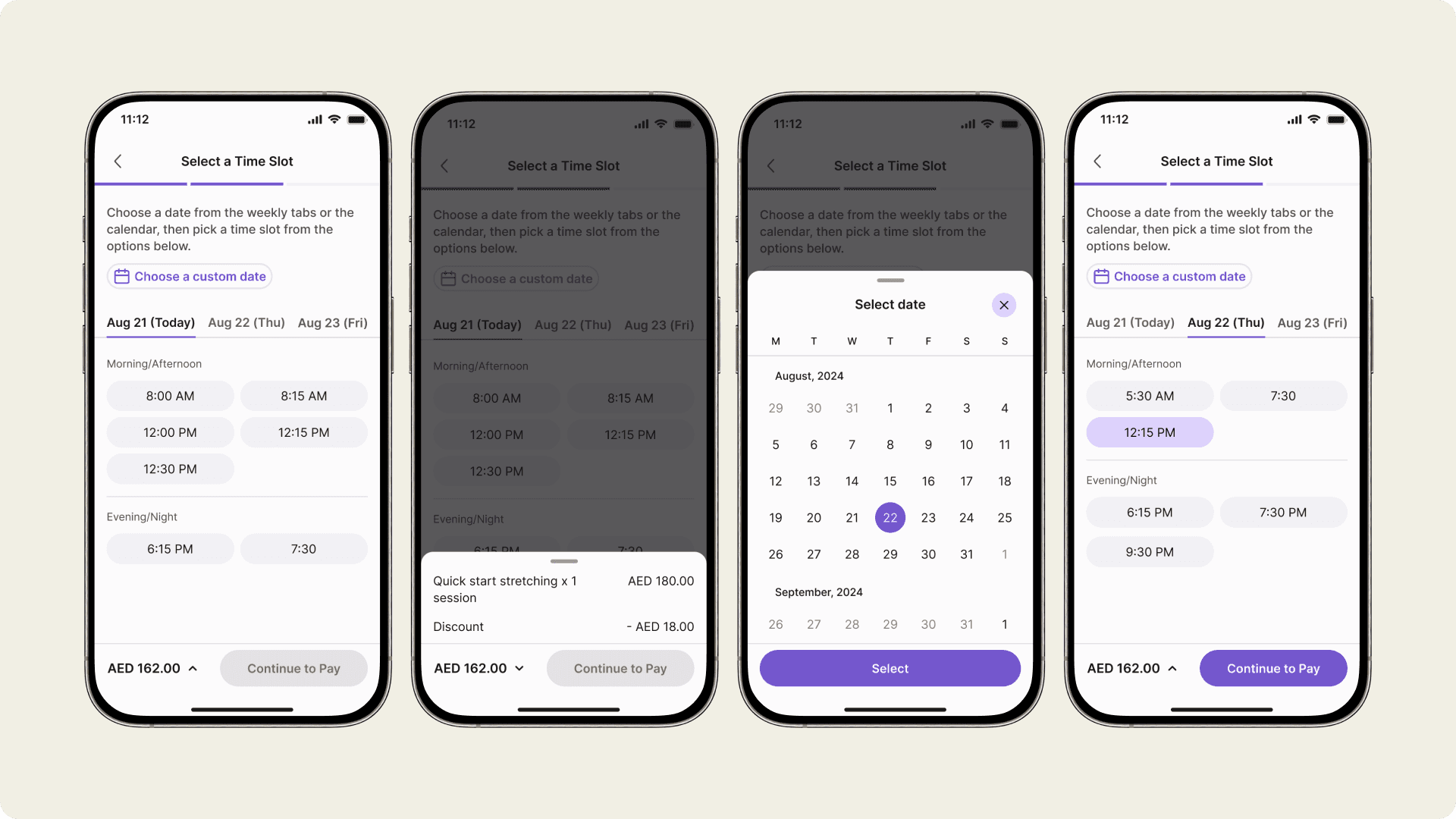
Select date, and time of the future single or multiple session.
Choose date & time
The booking process is streamlined to allow users to select a coach, pick a time and date, and complete the payment within a few taps.
Select date, and time of the future single or multiple session.
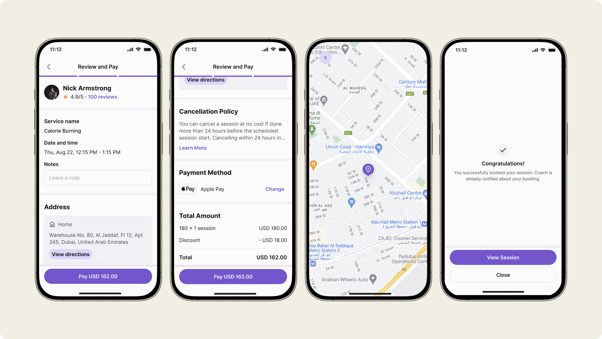
Review details & pay
The checkout process is quick and ensures that users are fully informed before confirming their sessions.
Checkout process including view location and success screen.
Usability Testing
At this stage, two versions of the booking flow were tested: one before the redesign and one after. Both followed the same process, but the new version had issues fixed. This approach ensured the test results were accurate and not influenced by any irrelevant factors.
Task
Booking flow
Type
Unmoderated, remote
Tools
Figma, Maze
Before vs After score
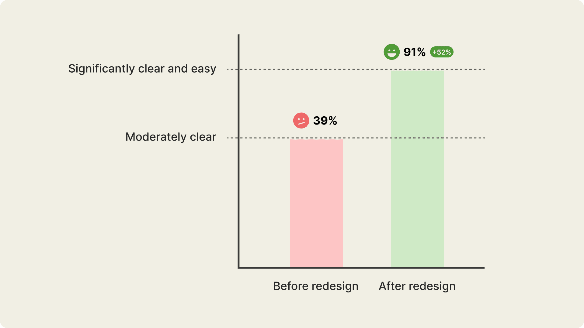
Users rate the new booking flow 52% better than the previous version. Before the redesign, most found the old flow unclear and difficult. After addressing user issues, nearly all find the new design clear and easy to use.
The graph is based on average score from usability testing from the Maze platform
Before redesign
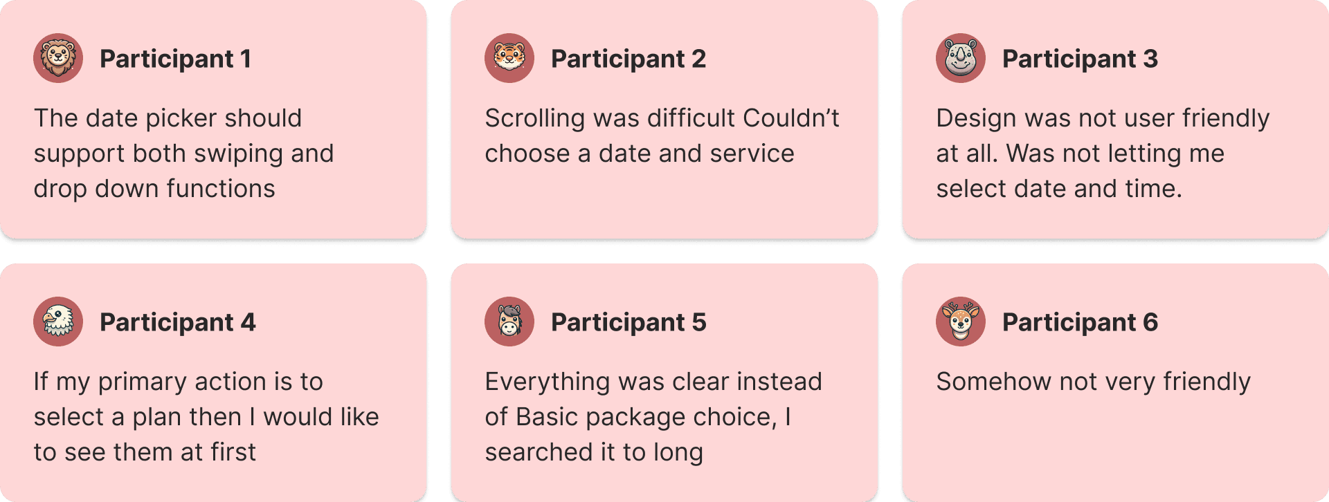
The user feedback across all three booking flows highlights both strengths and areas for improvement. In the Old Flow, users liked the intuitive design but faced navigation and technical challenges, making the process difficult for many.
The snapshot of user feedback from the old booking flow usability testing.
After redesign
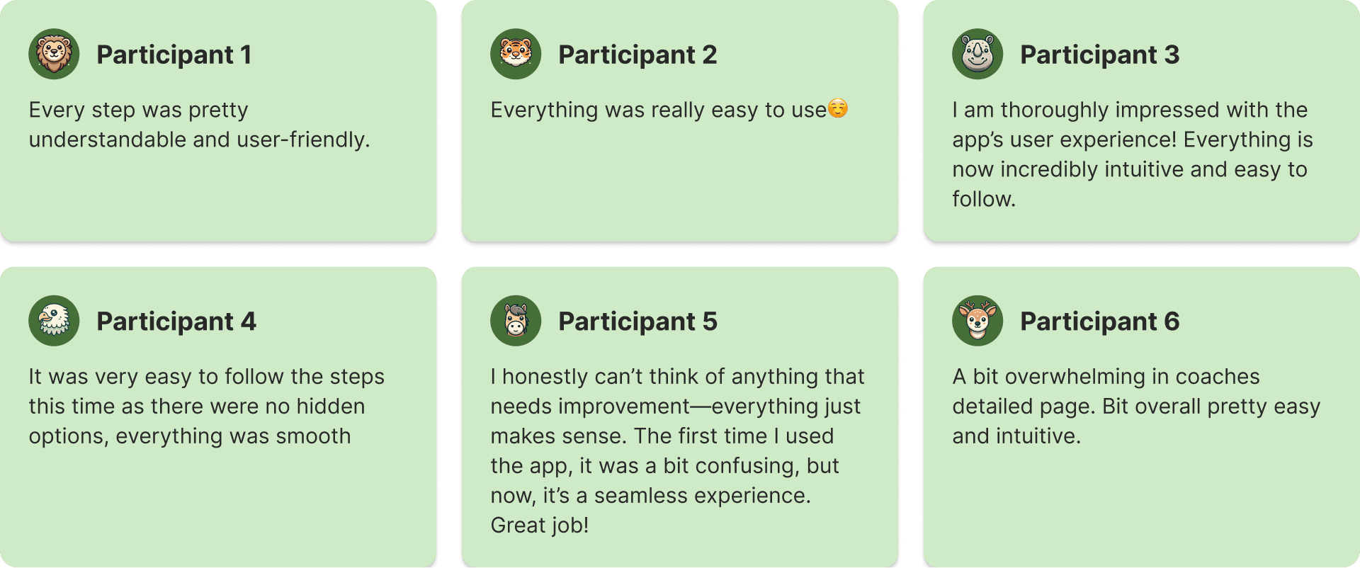
The user feedback across all three booking flows highlights both strengths and areas for improvement. In the Old Flow, users liked the intuitive design but faced navigation and technical challenges, making the process difficult for many.
The snapshot of user feedback from the new booking flow usability testing.
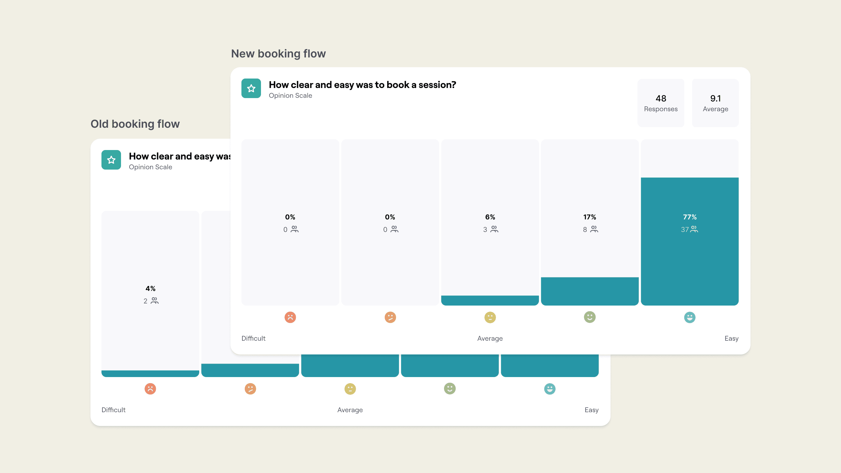
User sentiments from usability testing from both old and new booking flows.
Summary
The usability testing revealed clear improvements in the booking process across each flow. The Old Flow had moderate clarity but significant navigation issues. The New booking flow showed the most impact, offering a much clearer and easier booking experience, with users reporting fewer difficulties. In fact, the new flow was 52% better than the old one. These results demonstrate the positive effects of iterative design on enhancing user satisfaction and streamlining the booking process.
